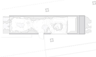
Precedent 1: A pop-up shop for Odin New York's fragrance collection. This design by Snarkitecture is a temporary retail instalment. The retail shop was transformed into an experience to capture the customers, formed by white cement replicas of Odin's distinctive glass fragrance bottle. A landscape was created with a rolling ceiling of the white replicated bottles, with a smaller landscape arising from the floor. The white cement bottle shapes were in contrast to the black (only black objects in the stores design) Odin's fragrance bottles, which are to be sold.
By turning this retail space into an experience the fragrance, to me, feels more unique as a scent and appears to be more of a luxury and an expensive product. Having a store act as the flagship store, selling merchandise that is distinctively different in the way it is presented or even not sold elsewhere, really brings the image of the product to a higher space in the buyers mind.


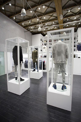
Precedent 2: Snarkitecture in collaboration with designer Richard Chai created this temporary retail installation from one single material. White architectural foam was cut by hand to create a glacial cavern experience for customers. The store sells clothes so shelves, niches and hang bars all had to be embedded into the foam to display the products to be sold.
I personally found this very interesting because of the large amount of material being used, but sorely a single material and the impact it creates is overwhelming. I just think its amazing. I would love to be able to touch it and run my hands along the material - this is something I could aim for within my design and it draws the public into he space.


Precedent 3: Over all this precedent I personally feel is a good retail design space, but the features that are inside the space really stand out to be because of their simplicity but the impact that it creates is amazing considering the use of an everyday object.
This project, Kith (again by Snarkitecture) had a focus on creating a new retail experience through the use of unexpected moments that use Kith's products. The main feature that I love the idea of is a double height wall with nearly 15,000 custom Kith branded pencils inserted into it creating an appearance of a subtly moving form. The wall is interactive as well as customers are encouraged to take a pencil from the wall as a souvenir of their visit. This helps the customers to engage with their surroundings and also creates a new way of experiencing the space.


Precedent 4: STARCK designed the Jean-Paul Gaultier fragrance shop in Paris, France. The design feels soft and is a light peachy/pink colour aligning with "Classique", the female Eau de Parfum from Jean-Paul Gaultier. The space feels (from the images) not very inviting, I feel as though if I was to visit this space I would not want to touch anything as it does look/feel wealthy and expensive. The bottles of perfume inside the glass domes I think look attractive, it looks as though they are each on their own little pedestal holding them above you as you'd look at them.


Precedent 5:Interactive experience at San Francisco Airport. Pacific Gateway has partnered with San Francisco-based technology firm Float Hybrid to develop interactive displays that respond to individual shopper interactions using Float's Anything Interactive technology. As a customer approaches the display, lighting and a welcoming screen is activated to encourage shoppers to interact with the products to access the information. The content on the screens then change depending on which product is picked up.
"In this digital age, shoppers want information in real-time to make better decisions. We are using cutting edge technology to provide shoppers that education with the touch of a product" - Kenneth Howe.

This technology is something that helps to break the barrier between physical shopping and online shopping, merging the two together to create an informed decision when buying a product. This may be something I could consider when designing the retail space. Firstly I need to figure out what exactly I am wanting to sell within the space, and to what extent. A designed retail space in the form of selling products or more of a experience of the product etc.


Precedent 4: STARCK designed the Jean-Paul Gaultier fragrance shop in Paris, France. The design feels soft and is a light peachy/pink colour aligning with "Classique", the female Eau de Parfum from Jean-Paul Gaultier. The space feels (from the images) not very inviting, I feel as though if I was to visit this space I would not want to touch anything as it does look/feel wealthy and expensive. The bottles of perfume inside the glass domes I think look attractive, it looks as though they are each on their own little pedestal holding them above you as you'd look at them.


Precedent 5:Interactive experience at San Francisco Airport. Pacific Gateway has partnered with San Francisco-based technology firm Float Hybrid to develop interactive displays that respond to individual shopper interactions using Float's Anything Interactive technology. As a customer approaches the display, lighting and a welcoming screen is activated to encourage shoppers to interact with the products to access the information. The content on the screens then change depending on which product is picked up.
"In this digital age, shoppers want information in real-time to make better decisions. We are using cutting edge technology to provide shoppers that education with the touch of a product" - Kenneth Howe.


 |
The above images with the red balloons are from Swarovski. In this product display the small diamond ring would appear to be overwhelmed by the large and boldly coloured display around it, but I think that the boldness of it really makes the product stand out. It is communicating to the customers that its a celebration if you were to receive this ring evoking happiness and likewise emotions to the product. I love the emphasis on red, a colour of love and over all really bring the right type of attention to the product of a ring.. potentially an engagement ring.
Alexander McQueen's display window is the nature/greenery image with a single mannequin. I think this look beautiful, especially in a city where seeing greenery and soft luscious things really do juxtapose compared to the commonly harsh lines of the building structures and monochromatic colours.
Fendi has used replicas of sticky pads to create a backdrop for their display window. Again I think by using objects that aren't usually used in such a way really creates a powerful image for the consumer.
Selfridges has the black and white images from above. The simplicity that they have in each image is really capturing yet I am not too sure what they are really about - yet I am drawn to them. Why? I think purely because if the contrasting colours, but the harshness of the designs, I am not sure if they would be compelling for me to buy the products being sold.
No comments:
Post a Comment