Friday 31 July 2015

Plastic Bag forms/Experimenting

My initial design of having the full walls being blown up could be developed further. Here I have used plastic balloons and poked them through a hole - this is the plastic bag being blown up through the hole instead of being pushed through while being full of air. This was just an experimentation although I feel like it wouldn't be too successful as a design. When deflated they appear very weak and you can see that they don't fill out the whole hole.

The crinkling and contracting of the air does look interesting still. This could be developed or included in further designs. 


This is a different way of having the plastic bag push through grids/beams instead of holes. This would be a great for safety if I was to do blow up walls, these could be safety handles to grab ahold of so people can easily come up and out of it - can pull themselves up.


Tuesday 28 July 2015

Airship Hangers Inspiration

These images of the airship hangers are purely an aesthetic inspiration. The framing is beautifully crafted and is something I could use within a design. Encasing the actual space as a whole? Encasing the building inside of this like an exterior case/shell. Or I could interpret this into the interior space of the design.


Monday 27 July 2015

Further Research

Bubble: Hirshhorn Museum and Sculpture Garden
By Siller Scofidio + Renfro 
The Bubble is an event space planned for the cylindrical courtyard of the Hirschhorn Museum. It is an architecture of air, it is a pneumatic structure enclosed by a translucent membrane that is squeezed through the centre of the circular building, filling the void, and coming out of the top and bottom of the mass. The Bubble is a soft building inside a hard one.


This architectural design could be something I look at, as a soft and inflatable piece but inside the original building frame at 25 College Street. It could come out at certain points of the building and it would then also effect the lighting that comes into the space. The type of material used for it but also the pattern (if theres a pattern) would then also cast shadows across the space.

Las Vegas Air 
By Nicholas John Balderrama Morley
This project investigates the role of air within architecture, and its ability to not only permit novel forms and technologies but aesthetic experiences. This large shell encases restaurants and flavour labs that circulate scents throughout the building.


The way that this architectural piece circulates scents throughout the body of it really made me think about further enclosing the scent of each of my selected perfumes. I have already produced a initial concept that does enclose the scents at the scale that I think could be nearing on the biggest for the space but this has me thinking maybe I can go bigger.

Net Blow up
By Numen/For Use
This is an inflatable box like space with buoyant lack webs fitted tightly inside. Visitors are invited to come inside the form and bounce around and off the wall, floor and ceiling as the soft form allows you to. During night a light from the inside is on which makes the view of it from the outside to appear like a projection. Silhouettes of the people inside are formed and can be seen through the white exterior shell. 
This makes me question my space. Currently I am thinking strictly for day time use as a retail store, but do I want it to be accessible during night hours or is it still viewable and interesting even while no ones inside the shop?


This image below is the Salt Building in Vancouver by Action Ostry Architects. The reason for this image is it reminded me of the structural beams at the space at 25 College Street. An idea I had from this was to even add to the existing beams to create more but then to use the idea above, of a inflatable and to then have it squeezing through the beams also effecting the lighting that comes into the bottom of the space. I could play with this.


The image below it just caught my eye. The simplicity of the space is so open but the intriguing part takes place above you by structure and lighting.


This image is Anne Ferrer's "Blow Up" where she has created inflatable sculptures. I think this would be fun to be in as a space but, and I could design a space where the pre existing A B C blow up letters cover the space, but I want to get more of a design into the space and to create more of an expeerience for customers but also a practical one.


This image is from the Matakana Movie Theatre in Auckland. I have personally been to see it, and it is overwhelming by the amount of the flowers and the artificial light that falls on them really forms a depth to them which makes you feel enclosed by them.

I like this idea of covering a wall and making it a feature. Here they have used flowers, but I enjoy the idea of using something more harsh and rigid to form something intriguing and interesting.


Sunday 26 July 2015

Existing Stores

Karen Walker has products at multiple department stores but also has her own stores - like the one on Wakefield here in Wellington. The images below are from the store. The crocodile is a very unique and unusual thing for a store to have. Seeing this makes it seem as through Karen Walker, if she was to be my client for the design, would be open to a shop that has a unique experience to it.


Also pre existing fragrance shops really just hold all the multiple different products together and display them with brand names really standing out to try sell the products. 


Saturday 25 July 2015

Light Box

The light box dimensions are 360 x 360

Just an aesthetically pleasing technique of joining, although not possible without adjusting it due to it being a box, not poles.

This is an aesthetic technique but could be wrapped around the edges of the box, combining the sides.

Multiple different joingings

Simple joining technique without having to really using anything to fully combine them. This is more of a non permanent way, yet would still hold it together. 

Love this. I think its has a beauty to it. Could be something to look at for a pattern or getting light into the space.

The use of yarn/thread is really interesting, adds another element to the work and creates interest. 

To combine the edges of the box, creating a slot for two sides to fit into - another option
An idea for the light box, imitating a smaller version of a larger wall like this.


Thursday 23 July 2015

Initial Final Design

Design Explained:
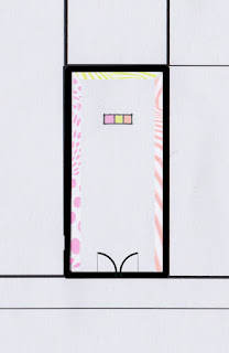
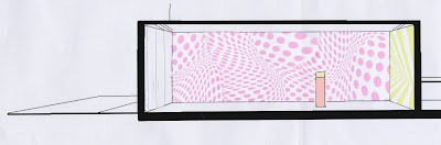
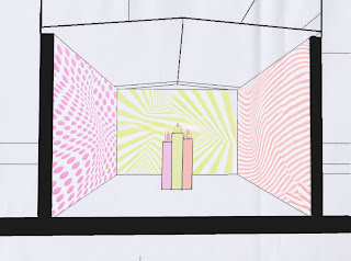
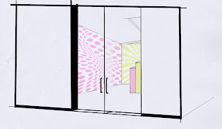
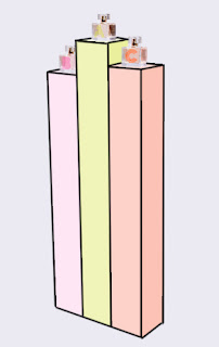
This design has three interactive walls that are large blowups in the pattern of the three scents of the Karen Walker range. The three walls are softly full with air and infused with each individual scent. As customers come into the space they will be overwhelmed with the height and size of these blowup walls - each with their individual patterns and breathing slowly as air is pushed into them when needed - customers will be able to lean into them and become enclosed by the soft and calming feeling. The microscopic holes in the blowup walls will be pressured by the customers weight, releasing air infused by the perfume. This will allow the customers to be surrounded by the scent, experiencing it within a unique way. At the rear centre of the space three tall blocks extend to a height  with the corresponding colours of each perfume and the bottled perfume at the top. Lights shine up into the glass bottles really making them stand out and be idealised. Within this display stand, at the back, shelves of the products sit underneath a indented cubby hole where a computer and payment methods sit for purchases.


FEEDBACK form group presentations
- pushing through holes, inflatable areas
- are they to be inflatable? maybe they just have the appearance of inflatable walls meanwhile they are actually a solid form.
- could be too bulky over all? Fragrance is a intimate product - make the space more intimate?
- pastels
- scratch stickers, the idea of the smell
- incorporate heat, how the heat of the body at points of the body helps to release the smell
- illumination through blow ups

Research
- Jeff Koons
- Pneumatic architecture
- Japanese artist (wellington) dotted spaces
- Ingo Maurer

Tuesday 21 July 2015

Ideas - WeekOne

Enclosed
Three interactive walls that indulge you as you lean into them. Blown up walls communicating the three different patterns on each of the blown up letters A B and C, each being the individual scents. Soft and squishy walls like the feeling of the toys below (unsure if recognisable - kids toy) but appearing like the ABC (also below). Each wall infused by the scent corresponding to its perfume. This would be how you smell the scent, being enclosed or wrapped in it, making it a comfy and unique experience for customers to smell the three different scents. The space in the middle would be empty apart from a sleek counter in the middle displaying the three perfumes in the glass bottles - purchases can be made here.


Blown Up
- hanging
endless amounts of hanging ABC blow ups are strung from above, all at different levels. Basically this idea would work around customers choosing which scent they with to smell and popping one of the selected letters. The matching scent would be infused within the air inside the corresponding letter ad burst into the air, allowing them to smell it.

Interactive playground
Created by the cubes in the image below, larger sizes of them to create a space full of them where they can be physically moved around to ... why? This idea needs more to make it a full concept and idea for a working retail space.


Ingredient/notes
By using the heart notes, base notes etc (basically the ingredients) of the scents - design a space that basically is covered in all these ingredients. Fake ones would be needed to not interfere with the smell but infusing them all with the perfume scent, triggering the brain to associate the perfume with the ingredients. A visually stimulating space where connections can be made in relevance to the product.